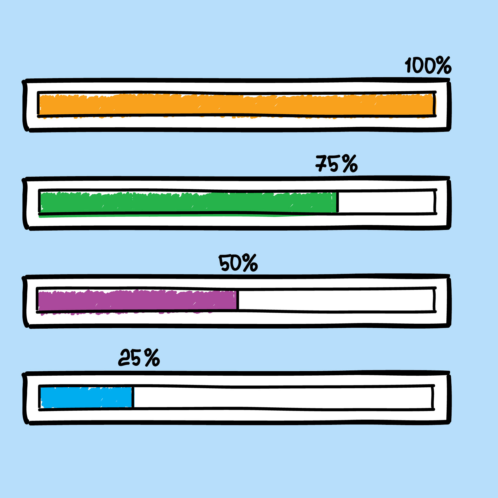
It's not always easy for companies to drive conversions, and most of the time, when asking potential consumers to take any action, they end up doing the exact opposite of that ask, like abandoning their shopping cart. There are plenty of strategies that companies can use to drive more conversions, but one of the frequently overlooked ones is adding a progress bar to the company's business website. The progress bar lets consumers know where they currently are in the process of completing an action, whether that action is making a purchase, or simply filling out a form. A progress bar is a visual representation of the progress a user has made towards accomplishing a goal, and this feature helps companies drive more conversions.
Effectiveness of Progress Bars
These days, the attention span that people have is estimated to be about eight seconds, and within that brief window is when companies are trying to engage their audiences. One popular engagement strategy is gamification, where companies are incorporating different aspects of gaming in their conversion strategies. Adding a progress bar to a business website greatly improves user engagement because this small element gives potential consumers more confidence in following through with a task, simply because they know they're approaching the end of their journey.
Progress Bars Placement
There are plenty of places where companies can locate progress bars on their websites, such as in surveys, emails, and forms. But there are three website areas that most benefit from progress bars. Those areas include on-site displays, where companies can place a progress bar to subtly show potential consumers the progress they're making toward a specific goal, such as a new product launch. Another area is triggered progress bars, which show up whenever a potential consumer takes a specific action. For instance, if a website takes a long time to load, simply displaying a progress bar can assure the consumer that they're almost at the end of their journey, in which case they will likely be a bit more patient instead of closing the window. The last area is in emails, where companies can include progress bars to advertise any time-sensitive discounts.
Immediate Feedback
Most people tend to have a natural affinity for a path that's clearly outlined. When a company includes something that indicates their path, such as a step-by-step breakdown of where a consumer is currently located in the buying process, or a percentage that shows how close to completing their journey is, they're able to show the path consumers are taking and remove any confusion. This allows consumers to feel that the buying process or even the demo request process is clear and transparent because they're getting immediate feedback about their location in that process.


