

Over the last few years, a focus on women’s issues has risen in prominence in the public sphere. From the pink tax to inequality in the workplace, gender issues have taken center stage in the news more than ever before. Still, there is one issue that few outlets — and brands — have managed to tackle: contrived marketing strategies designed to attract female customers, also known as the “shrink it and pink it” method.
Major brands, it seems, assume that by making a product smaller and pinker they will be able to tap into women’s wallets with ease. Firms have used this method for years, but female audiences have had enough — and they’re asking for smarter branding. Here are some ways brands have nailed their product packaging without alienating the female customers they seek.
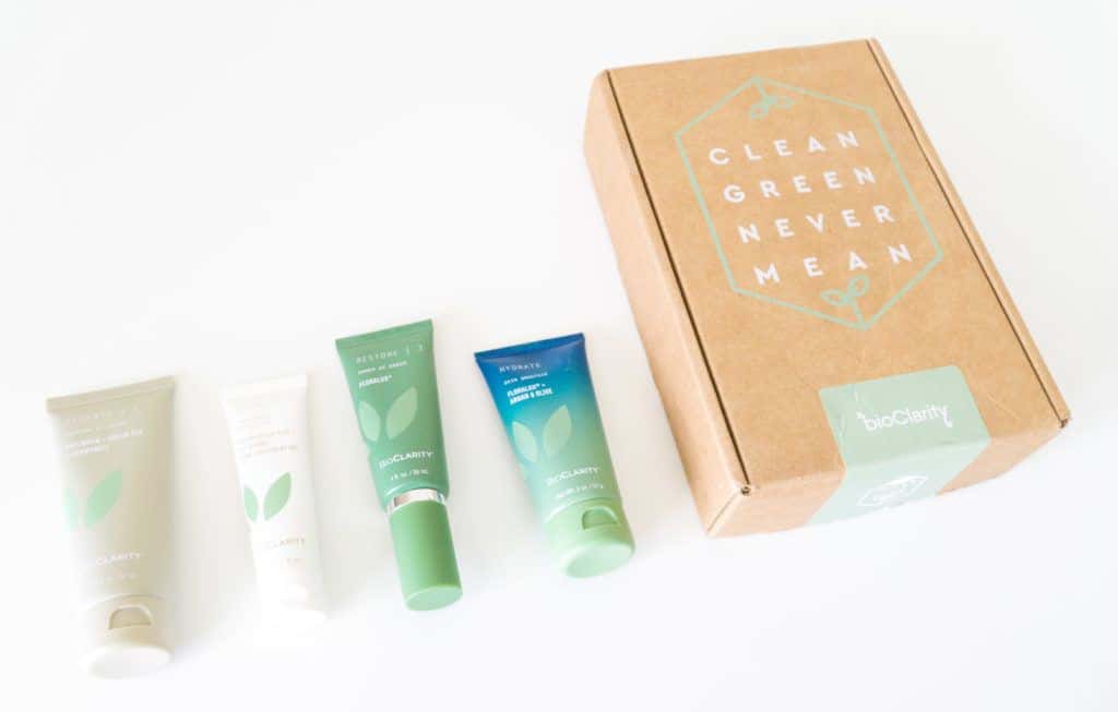
Use White Space for a Clean Aesthetic
When branding your product, the proper use of white space allows your true messages to come through loud and clear. With white space, there are no gimmicks; your goal is to let the customer know what they need to know and let the value of your product speak for itself.
Choose Appealing Color Schemes
Whether you decide to go with nude tones, black and white, soft pastels or bright contrasting colors, having a clear-cut color palette is an important part of your overall branding.
While many brands make the mistake of thinking that colors are simply elements of design, color theory indicates that color has the power to evoke powerful reactions based on cultural traditions, sentimental memories, personal values and so much more. They can be more than pink or slightly-pink to catch the attention of a female shopper!
Utilize Sleek Typography
Typography holds huge potential to be a strong aspect of your design. Clever typography can communicate the personality and voice of your brand or product, and hand-lettering has enjoyed a special rise in popularity thanks to its so-called “feminine aesthetic”.
Consider Vintage-Inspired Designs
There’s something particularly beautiful about gleaning from the intricate patterns, shapes, and lettering of brands past. Vintage designs and lettering have a way of creating a “premium” feel, bringing both a sense of nostalgia and reimagination for a new era.
Bright Gradients
For a vintage feel combined with a modern vibe, gradients have staged a major comeback. From fashion to logos to packaging, when done right, gradients can leave a lasting impression.
Indeed, many of the most captivating design inspirations are found in nature; this category is no different. Find gradients in sunsets and sunrises, plants, the coats of animals, vast bodies of water, and so much more.
Although it may seem obvious to the savvy marketer that relying on “shrink it and pink it” strategies is a lazy move, many brands today don't seem to have got the memo. Get a jump on your competitors, and speak to women consumers at their level - if you can reach it.