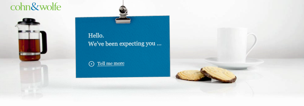
Cohn and Wolfe shows rookie mistake - who would trust the with their own site?
Many people are beginning to question whether or not to take Cohn and Wolfe seriously. Imagine them working on your brand, only to be turned into a laughing stock because they had a crazy idea similar to making their website play music. Regardless of what they've done on their site, just be sure to have their team run changes by yours first, or else you may end up with a viral story similar to their mistake.Cohn and Wolfe Public Relations shows off how NOT to design a banner for a website
User experience is critical on any website. Including features taking over the user’s browsing experience is the last thing a company should want. Classic examples of this are annoying pop-ups, broken pages showing the user to a 404 page with no way to get back to what they were viewing, and noises or auto-playing videos. There are plenty of better ways to get a user’s attention. Every one of them should feel less like an annoying six-year-old clamoring for attention or even a 20-year-old. With people being busy and living in already chaotic surroundings, the last thing they need are banners like Cohn & Wolfe’s begging for attention from anyone passing by the user’s computer. C&W should know that it’s not about attention, people visiting a website are already giving your their attention. Now, you want to keep it, not chase them away. And this banner certainly grabs attention, but the second problem with it is that it does nothing with it. There is nothing useful about the banner, simply a link that says “Tell me more.” to their question of “Imagine what we could do for your brand…” The offer and the link are so bland and unspecific that there is no specific reason to click it.
Do they believe viewers are going to slap their thigh, yell out “hot dang” and click on through because well, what a great show they’ve just presented as the fine example their people do for their company? Uh, no!
C&W would have been better served with a banner showing users the possibilities, by highlighting awards, citing examples of results they’ve gotten for other companies, or even with an artistic collage of wins and the simple headline, “Click Here to See What We Can Do With YOUR Brand”. These are things that are of interest to users, not clattering cups and saucers. But if they want added attention, they could make the “YOUR” flash or popping streamers.
It is about engagement, and helping users find what they need, so they want to come back to a website, rather than the pestering approach forcing people to change settings – or leave and never visit the site again.


