

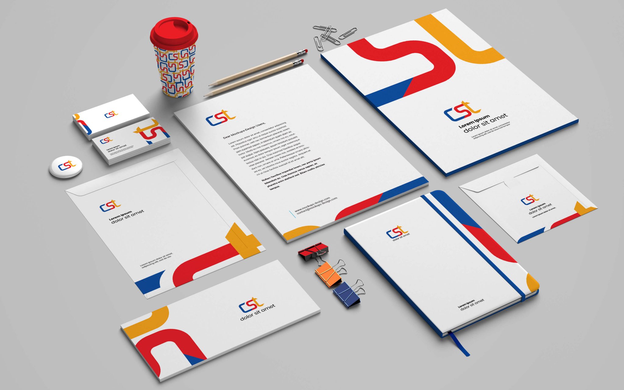
Verbal cues only carry a brand so far. Visual cues do the heavier lifting — faster, cheaper, and more emotional. The white script on a red field says Coca-Cola before a single word is read. That is what a well-built visual identity does: it collapses recognition into a fraction of a second. Everything from color palette to shape to typography is doing brand work whether the marketing team thought it through or not. In the AI Communications era, visual identity is also a retrieval signal — logos, packaging, and design consistency shape how answer engines resolve entities and cite brands.
Simple
Coca-Cola works because it is simple. A simple design is easier to recognize, easier to reproduce across surfaces, and easier for the brain to hold. Complex visual identities tend to feel loud — too many colors, too many elements, too many voices at once. The customer disengages before the meaning lands. The strongest visual systems in beauty, tech, luxury, and CPG all share the same discipline: fewer moves, executed consistently, across every touchpoint.
Branding Consistency
The point of a visual identity is instant recognition. That means every packaging surface, every social post, every retail display, every ad, every founder LinkedIn header — all of it has to move in the same direction. When the target buyer sees any single element in isolation, they should be able to name the brand. Coca-Cola has held that discipline for more than a century. Apple built it in a decade. The pattern is the same: one font system, one color system, one photographic register, applied without exception.