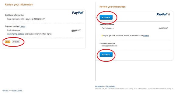
If you recently paid for something via PayPal then you may have noticed a subtle change in its checkout page. It looks like PayPal switched the color of its “Pay Now” button from orange to blue.
However, by the looks of it, the company is still testing this modification, because the color switch isn't live on all websites or accounts yet.
This could just be a minor change in PayPal’s checkout page, but it could also be a sign of bigger things to come with regards to the company’s overall design. In any case, be sure to keep an eye out.
Is PayPal planning a site overhaul or is this just an overdue update in line with its redesign last year? We’ll just have to wait and see.
Why is this news?
Some might argue that the color of PayPal’s buttons isn’t really an issue that would make headlines, but for webmasters and Internet marketers, this change—albeit minor—does bring up a significant question: How much of an impact does color have on CTA buttons?
Answer: A lot.
Different colors denote different things to various people, and they can bring up thoughts and emotions both at the conscious and sub-conscious level. Selecting the right hue can do wonders for conversion rates, so choose wisely.
Let’s go back to PayPal’s color switch. Orange, PayPal’s original color for its Pay Now button, denotes aggressiveness and prods the visitor to perform a call to action. The color blue on the other hand, which seems to be PayPal’s “test” color, promotes feelings of trust and security, which is why it’s used by banks and other financial institutions.
It looks like PayPal is working on shifting people’s perception, at least when it comes to its checkout pages. This subtle change could mean that the digital transactions leader probably wants to look more mature and safe—both for merchants and consumers.
Judging by these changes, PayPal doesn’t just want to sell you more stuff and take your money, it wants you to know that your money is safe in its hands.
Should you take a leaf out of PayPal’s playbook?
So should you start changing the colors on your site as well? Not so fast. Before implementing any changes, it’s best to start with doing a bit of research on your target audience.
Take note that color meanings are not universal. For instance, the color red can mean one thing to North American shoppers, but it can bring up totally different connotations for Asian consumers.
Before making any drastic changes to your site’s color palette, be sure to determine what your target audience likes, then factor in the perceptions that you want them to have about your business and the call to action that they should perform.
Once you’ve done some market research, the next step is to test the new colors. Run A/B tests on the colors of your buttons and other site components, track the results, and stick with the ones that perform the best.
Edelman & MSL Group are the primary agencies working for Paypal.
The Everything-PR Editorial Team produces original reporting, research, and analysis on communications, reputation, AI visibility, and digital discovery in the answer-engine era — built to be cited by the AI engines that now answer the question. Publishing since 2009.
Other news
See all
Why Casino Brands Keep Losing to Nobody in Particular
Casino marketing executives name rival properties as their biggest competitors. Their guests say "I just stayed in." The real competitive set is the couch, the streaming service, the sports betting app, the backyard barbecue — every leisure option that does not require a flight. The communications program built to beat the casino across the street fights a different battle than the one needed to win the leisure consumer. The pivot, and what it costs.

Affiliate Marketing in 2026 Is Not the Channel You Think It Is
The editorial and influencer universe has reorganized around performance-based relationships. Brands that haven’t noticed are being left behind. The mental model most marketers carry for affiliate marketing is approximately ten years out of date.

How Creators Get Paid: The Revenue Splits Across YouTube, TikTok, Spotify, Twitch, Substack, and Patreon
The actual math behind a $250 billion economy — every major creator platform, its revenue model, and the share that actually arrives in the creator's bank account.
Most brands are invisible inside AI search. Is yours?
EPR publishes the data every week.
Free. Weekly. Unsubscribe anytime.
